| Project
1 Part 1
Postprocessing
First of all, you need to tell the program to read the last set of output results.
Go to
General Postproc -> Read Results -> Last Set
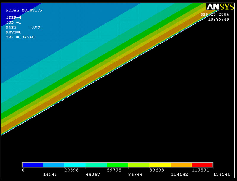
1. Contour Plot
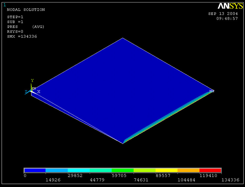
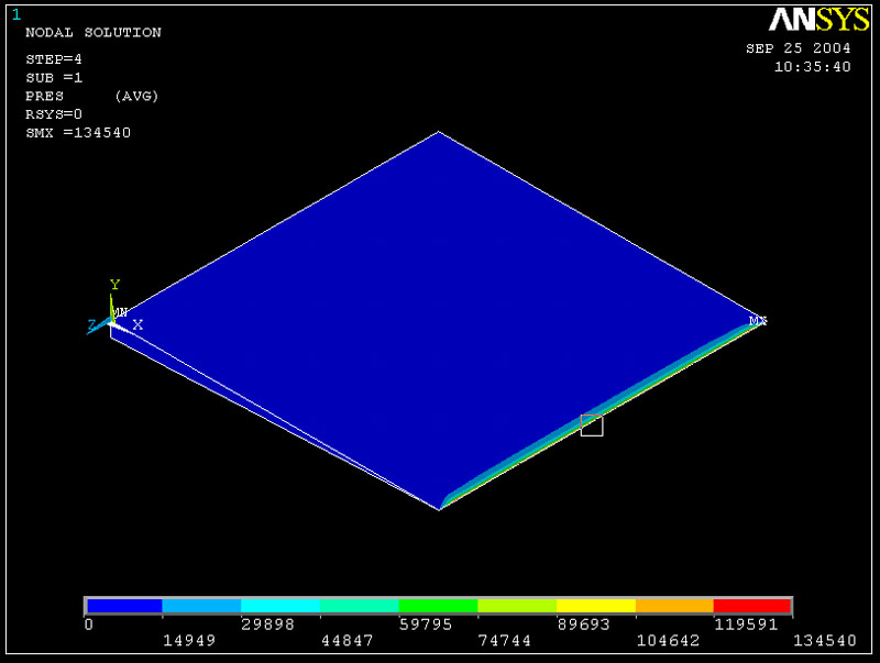
(1a) Contour Plot of Pressure
Go to Postprocessing -> Plot Results -> Contour Plot -> Nodal Solution
Click on DOF Solution
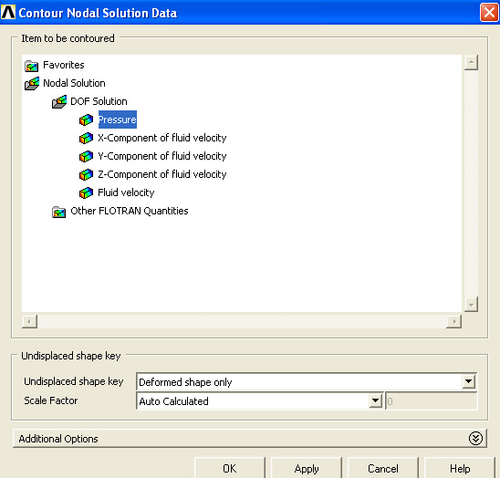
Plot should look like
If you want to zoom in to the right side of the fluid, just go to
Plot -> Pan Zoom Rotate
then click on BoxZoom
To get a better view of this contour plot, you can also respecify the range of which each color represents. To do so, go to the color bar in the bottom of the screen, right click, and then select "Contour Property"
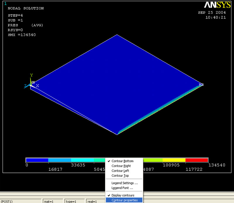
Then click on the tap that says "Range"
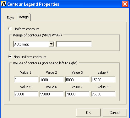
You can play with the value to get nice contour plot. click OK and replot the fluid.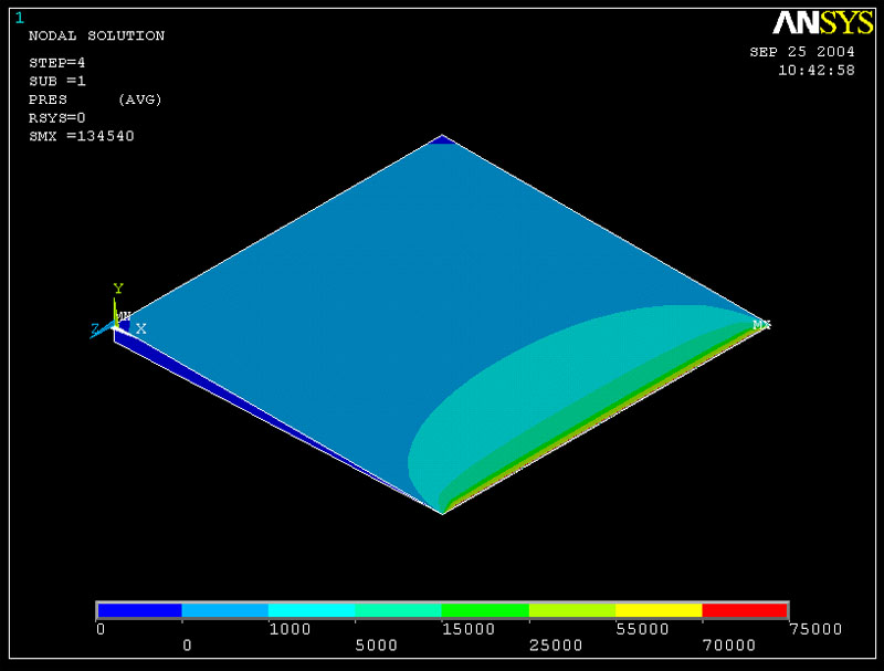
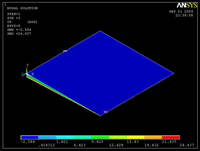
(1b) Contour Plot of Velocity
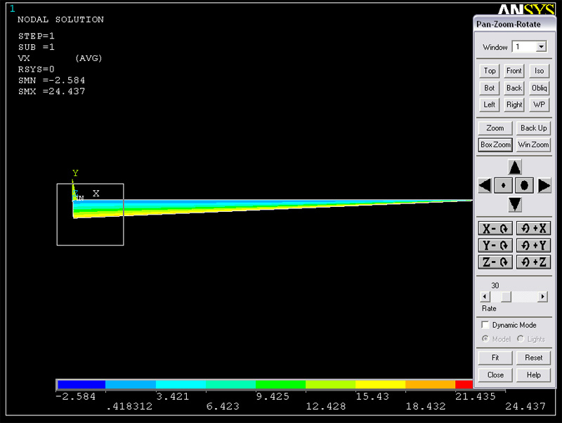
Select “X-component of fluid velocity”. This is what the plot would look like. You can get a "front" view of the fluid. Go to Plot Controls on the menu bar. Then select "Pan Zoom Rotate". Select "Front".
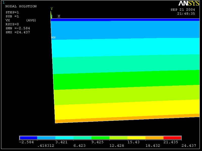
Box zoom the left end to see velocity profile.
Closer View of VY Contour Plot On the Left End
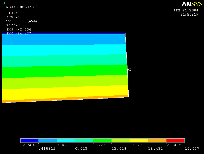
Here is the plot of VY at the right end
Right End's VY Contour Plot
2D Plot
2. 2D Plot
(2a) Pressure vs. x at z = -W/2 = -1 mm, y = 0 mm
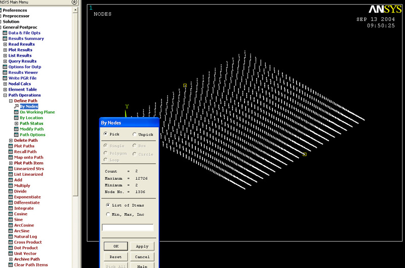
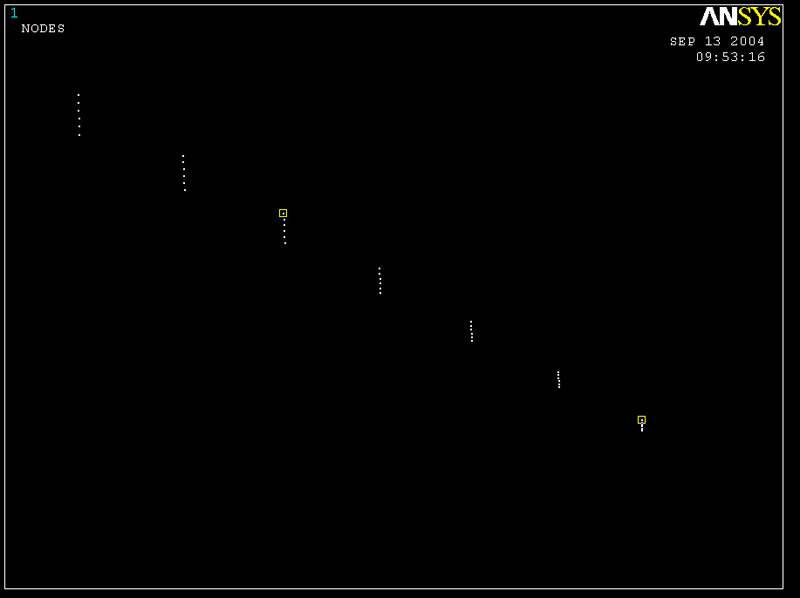
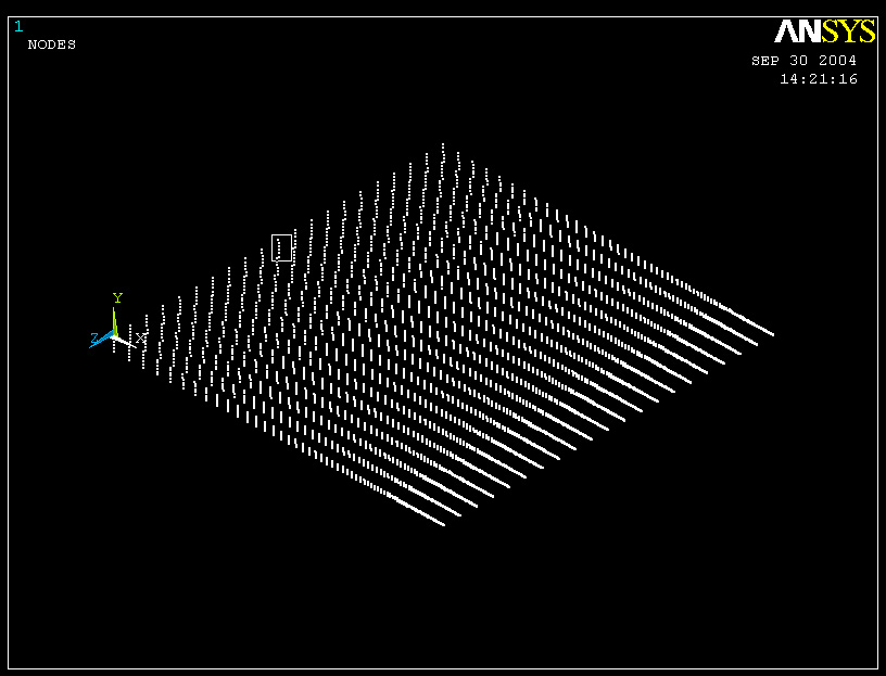
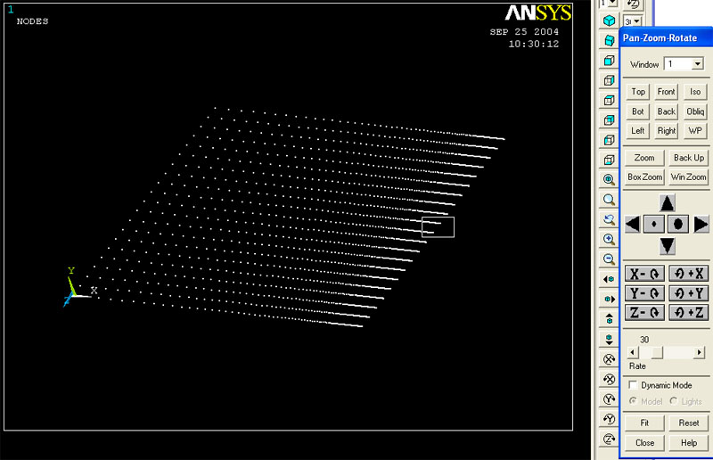
First of all, you need to specify the path where you want to make a plot of. To do so, you need to select starting node and ending node along the path and the number of points in between. Thus, it is easier to plot out nodes and then pick out the nodes when z = -1 mm. To do so, go to plot -> Nodes.
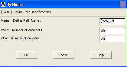
Click on Path Options -> Define Path -> by Nodes. Then click on the two nodes.
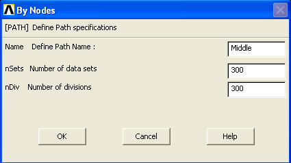
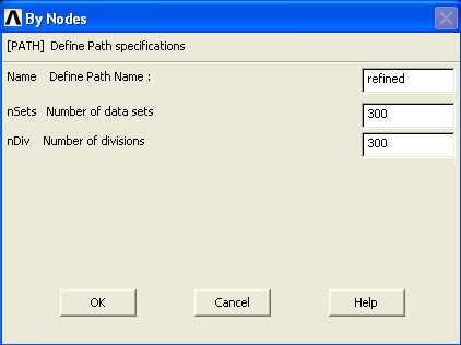
Rename the path however you want. Set the number of data sets to 300 and the number of divisions to be 300 also.
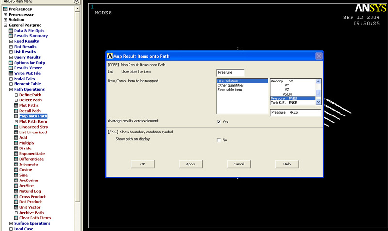
In Path Options, click Map onto Path. Then select Pressure
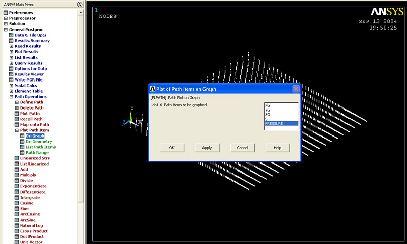
To plot the graph, click on “Plot path items”
Select pressure
Then you will be able to see the plot. You can see that the maximum pressure is not very close to the analytical solution. (P_max should be 1.171E5 Pa). So we should define the path very close to where the maximum occurs.
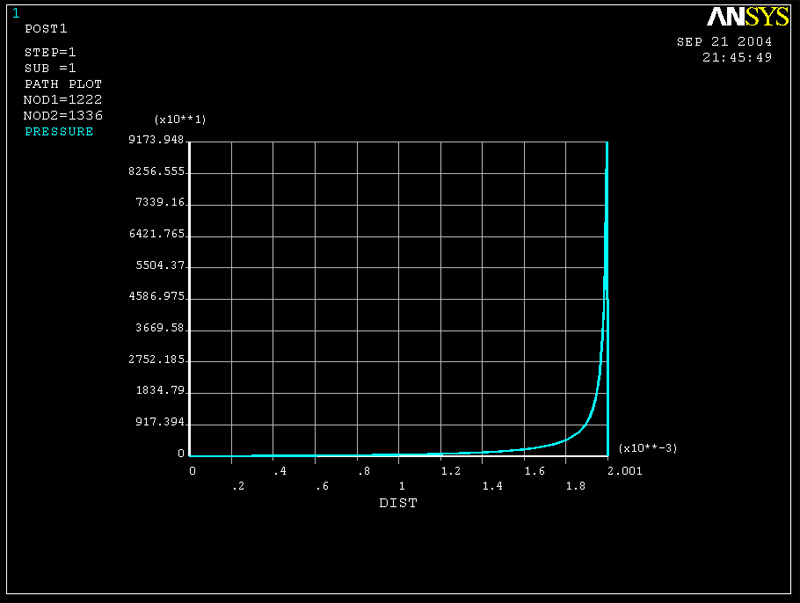
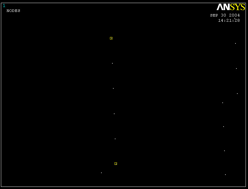
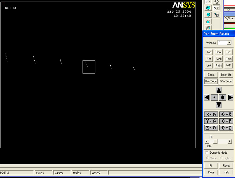
Redefine the path, by going back to the command, "Define Path". Then Select "By Nodes". Select two nodes. Now you can zoom in (the right most end) to get a better view. To zoom in, go to Plot Controls -> Pan Zoom Rotate. Then select BoxZoom.
 | |
Map onto Path
And then
Plot Path Items
You should be able to see this plot
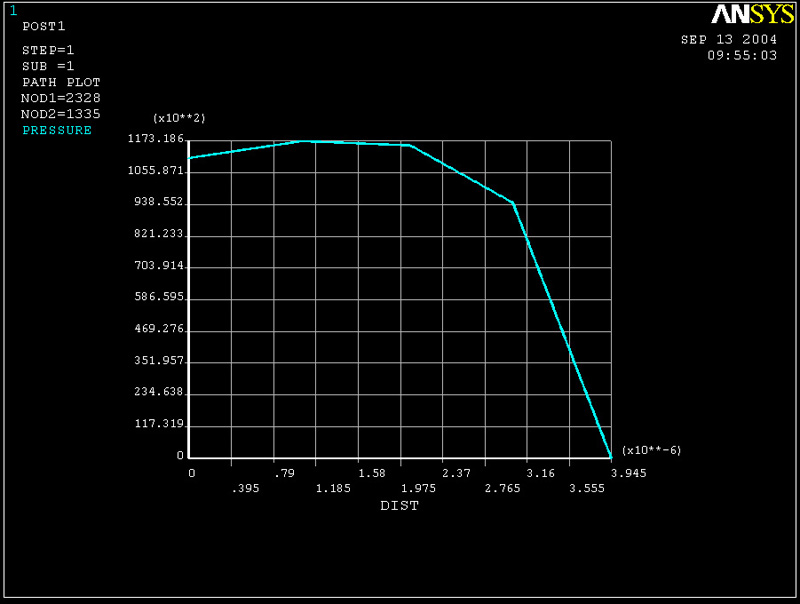
Now the maximum pressure comes very close to the predicted pressure from 2D analytical solution.
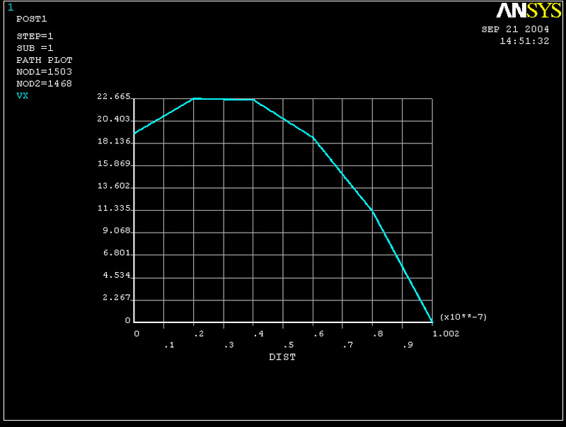
(2b) Plot of X component of Velocity vs. y at z = -1mm
-----Plot at x = 0-----
Select the nodes along the y axis where z = -W/2 and x = 2mm. Repeat the same step as in defining nodes for pressure plot.
Go to General PostProc -> Path Options -> Define Path -> By Nodes
Then you can use "box zoom" option to zoom in so that you can view the 6 nodes more easily

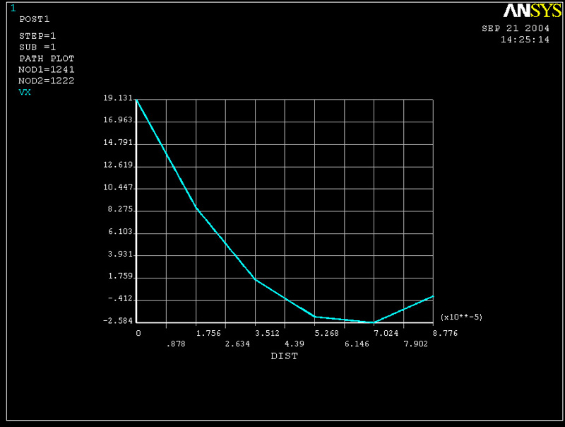
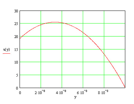
Compared to the plot derived from analytical solution.
Velocity distribution along the direction of flow can be described as follows.
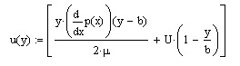
where b is the height of fluid at a given value of x
t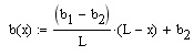
We can see that the results gives the general trend. However, analytical results and results from CFD do not math very well. We will get more accurate results if mesh are finer along the depth of the fluif (instead of meshing those four lines parallel to the z axis to have size = 0.1mm, try finer mesh. However, consider the fact that finer mesh takes longer time to compute)
-----Plot at x = 1mm-----
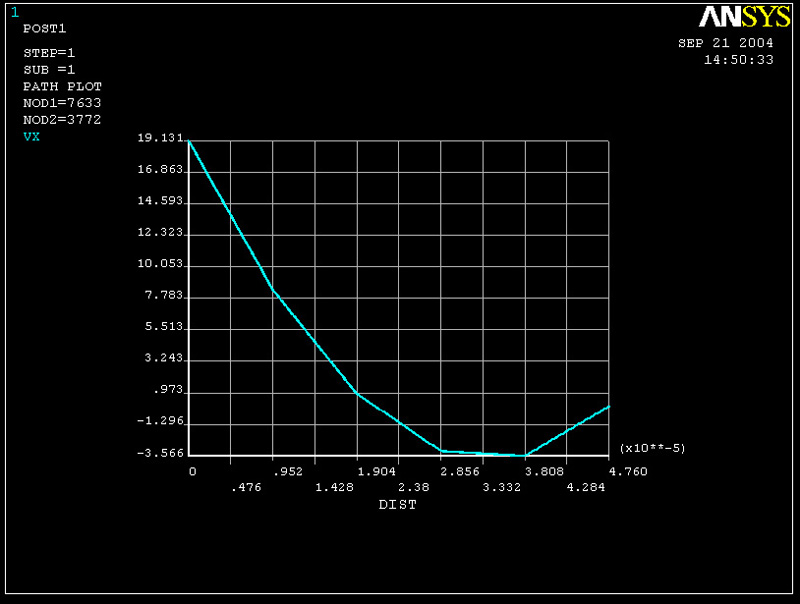
-----Plot at x = 2mm-----
As it gets closer to the other end, we can see that the results match theoretical solution better. This is also because the nodes on this side have smaller size than those on the left side (where x = 0).
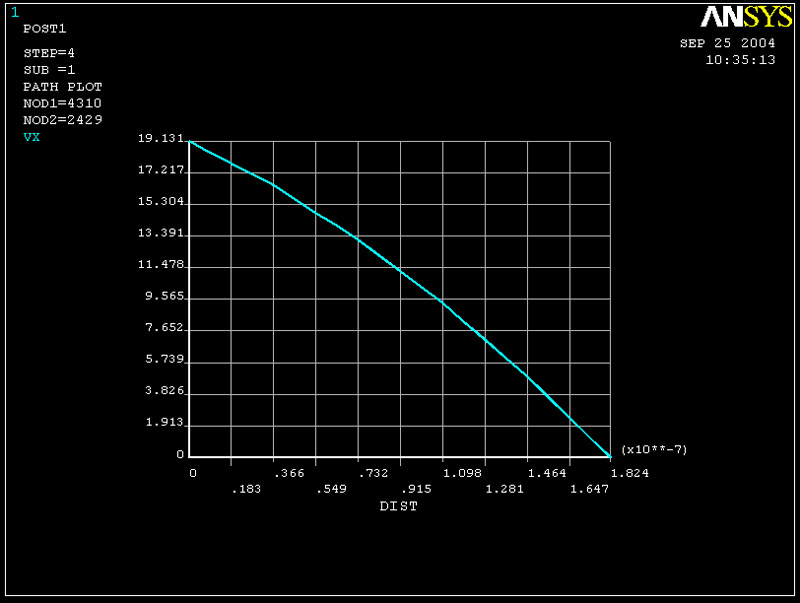
We note that the graph changes curvature as it gets nearer to this end. This is due to the sign change of dP/dx. If look closely at the pressure plot, the pressure has its maximum near the right end. Therefore any location after that maximum point is going to have negative slope, that is dP/dx < 0. We can also see that this slope has a very large negative number, therefore, the sign of velocity changes more quickly as it passes that maximum pressure point.
Note that where the maximum pressure is, we get dP/dx = 0 which allows the velocity profile to be linear.
What you can is to define a path by nodes, then map VX data onto the path and then plot the graph.
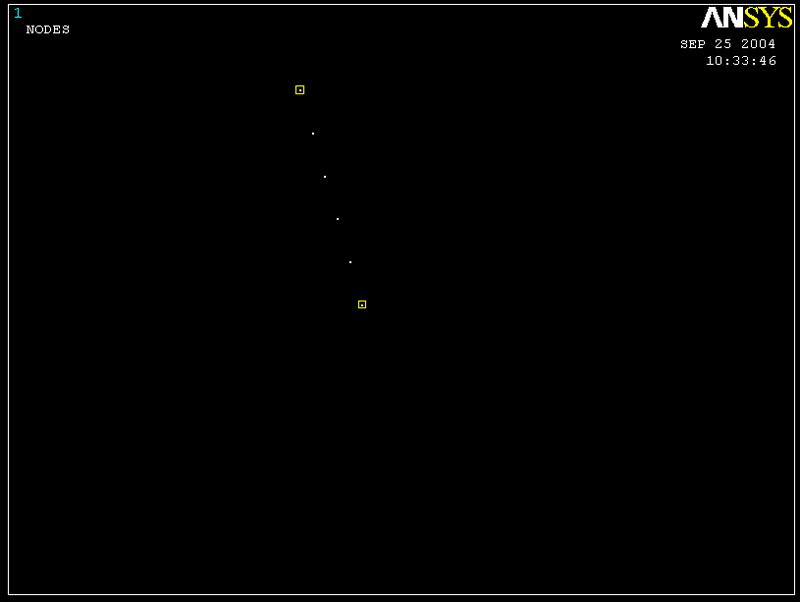
Plot out the nodes. Then zoom in so that it is easy to select nodes. As we know, the maximum pressure occurs about the third node from the right side. (See 2D plot of Pressure after zooming in)
Go to Path Operations -> Define Path -> By Nodes
\
Then map VY onto path and plot out graph, we would then get...
3. Integrate Pressure Over Top Surface
To do so, you can type on the command line.

Here is the code that you can use.
Type:
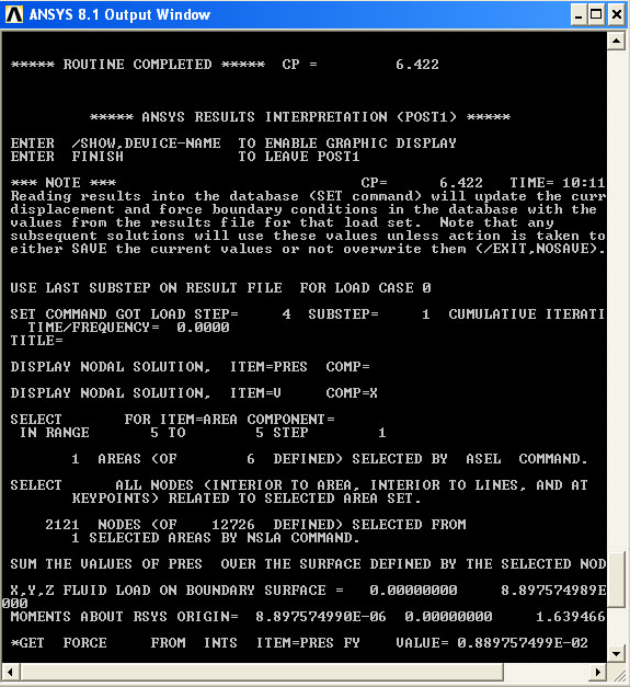
ASEL,S,AREA, ,5
This selects area "5" to be the area where you want to integrate over. (This might be different if you specify the order of area differently). Then type:
NSLA,s,1
which select all nodes on that area. To integrate pressure on top surface, type in:
INTSRF,PRES
And the program will integrate pressure over top surface. To get the actual value of force, type:
*get,FORCE,INTSRF,,PRES,FY
The force will appear on the command window.
You can remesh the fluid to get more accurate calculation of total force.
|
 |