Filipino American Association of Pittsburgh
An intuitive and modernized redesign of the cultural organization's website.
View Website →
For my 05-391 Designing for Human Centered Software course, I was tasked to design an interactive app prototype that would benefit Carnegie Mellon University students. After brainstorming several ideas, I decided to design an app that would help students locate free goods on campus. This was inspired by the “Free Food CMU” GroupMe, where students share the location where free food is given out on campus. However, this app would be more accessible and provide advanced features, such as a map, a calendar, and content personalized for the user.
After communicating with the client and examining their current website, we concluded that the three main problems of their website was:
To alleviate these issues, we aimed to:
We conducted a competitive analysis of other websites, focusing on cultural organizations like the Organization of Chinese Americans, the Italian American Association, and the Jewish Federation of Greater Pittsburgh. Overall, we found that the best strategies to present information and attract user interactions are to:
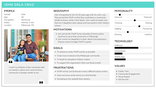
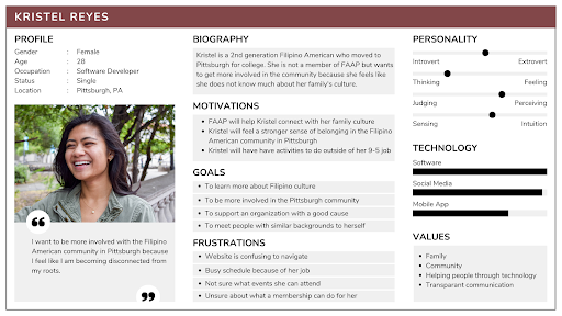
We also identified the three target audience groups:
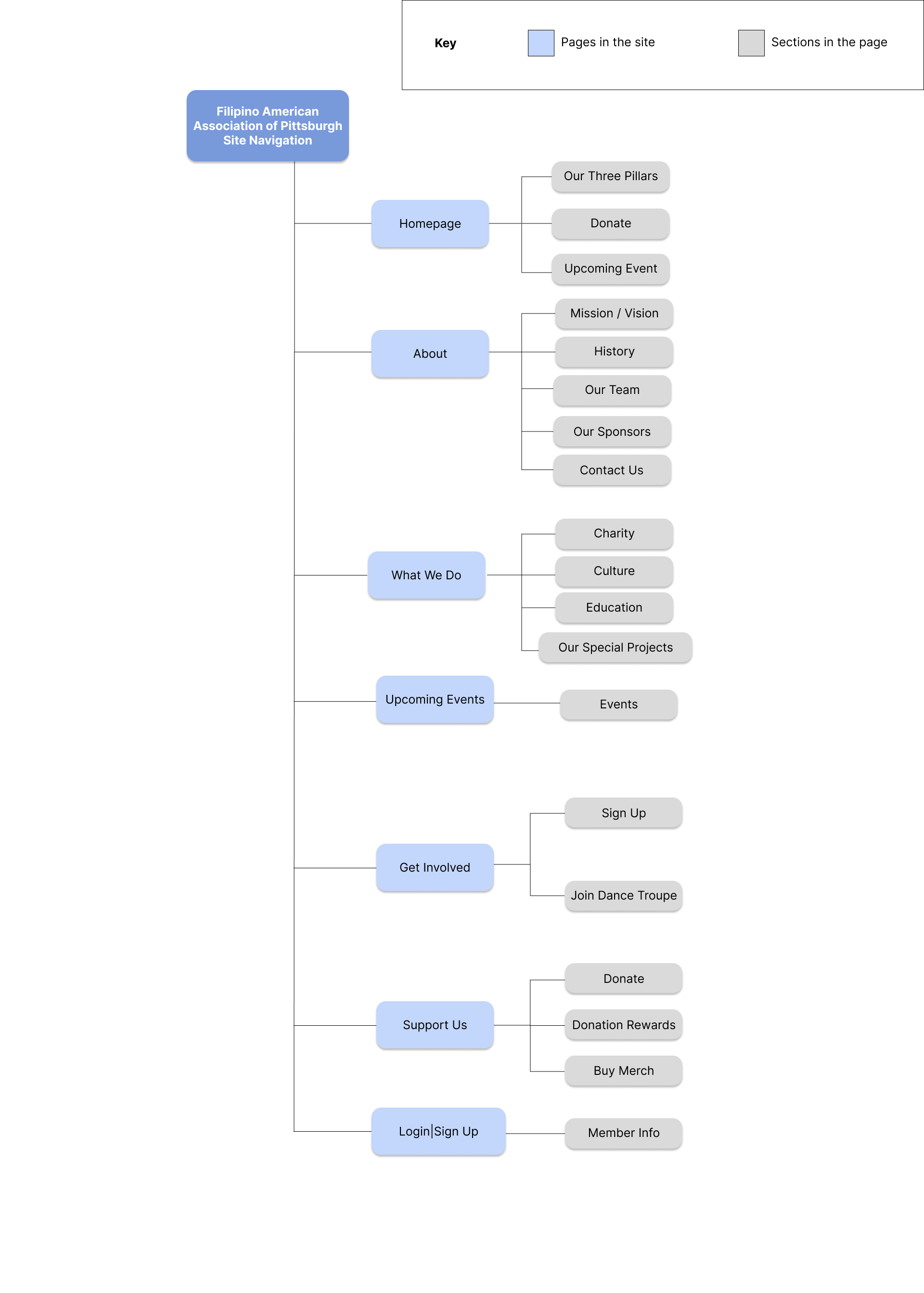
In order to create a cohesive navigation, we organized the site's content using a tree diagram.
Using Figma, we developed low-fidelity wire frames for desktop and mobile for each page of the website.
These wireframes were used for a preliminary user testing. We asked users that fit the target audience to describe their initial thoughts on our designs and complete task scenarios. Some recurring problems we've noticed were:
Following user testing, we aimed to address the uncovered issues. We created high-fidelity wireframes, focusing also on color, font, and image choice.
Our solutions to address the previous issues were to:
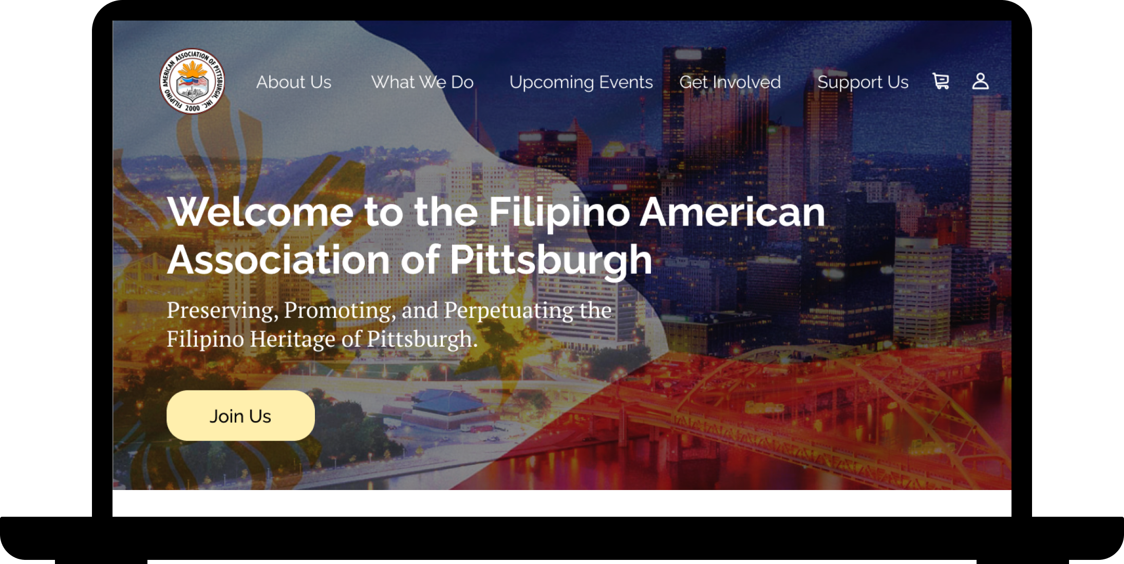
Our final coded prototype only incorporates the homepage, About Us page, Upcoming Events page, and the Support Us page, due to the scope of our project and the requirements of the client. We utilized HTML, CSS, Bootstrap, and Javascript.
Through this project, I was able to collaborate with many team members to carry out a client project. Specifically, I learned to:
Reflecting on the work, many improvements could be made, such as: