 |

|

|

|

|
|
|
|
|
|
|
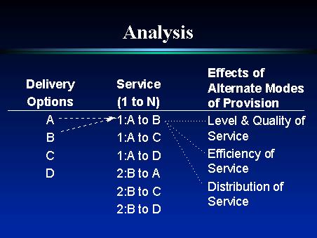
Some of you may be familiar with this concept, as it was first designed by a man named Michael Tietz, in the late 1960s. What you see here are the fundamental items that relate to the mode of delivery of a particular service.
We have all of the possible delivery options, which Will talked about earlier, ranging from purely public to purely private, here represented by the letters A, B, C, and D.
We have all of the services that we are considering...on this we only show two, with their current mode of provision...service 1 is currently provided using deliver option A while service 2 is currently provided using delivery option B. The services column shows all of the possible shifts in delivery options...service 1 can move to B, C, or D...service 2 can move to A, C, or D. For now we will only consider service 1 moving from provision method A to provision method B.
The “Effects of Alternate Modes of Provision” column contains the general categories of the different effects that should be considered, related to the shift in delivery method. These categories are “Level and Quality of Service”, as any change will likely affect the level of service that is provided and/or the quality with which it is delivered.
“Efficiency of service” is where we really consider the bang for the buck. Here we ask, given a level and quality of service, what is the most cost effective way to deliver the service.
Finally, we have the distribution of service, which gets at the way in which the service is distributed to the client, and how the population of people who receive the service is affected. Are people excluded from consuming the service, based on the way it is distributed?
Considering these three groups of items together, we can perform a series of comparisons to determine what the optimal way of delivering a service is...