Workshop 3: Starting with Excel Spreadsheet
Part 1: Let us have a look at the basic operations in Excel spreadsheet program.
Note: If you are already an experienced Excel user, you do not have to begin with this part, which covers the basics of Excel, please simply skip part 1. However, I suggest you quickly go through the simple tutorial and see if there is something useful for you or something you are not very sure about it.
Tutorial Page: http://www.usd.edu/trio/tut/excel/
- Please browse to this Excel tutorial page.
- Open your Excel spreadsheet: Start>Programs>Microsoft Office 2000
>Microsoft Excel 2000
- Follow the instructions in the tutorial:
- Go over the structure of a spreadsheet; (Basics of Spreadsheet)
- Practice in your Excel spreadsheet and understand the types of data in Excel; (Types of Data)
- Try formulas: basic math and specific formulas and make sure you know how to set formulas, change formulas, insert specific formulas and store the result in specific cells. (Formulas in Excel)
- Practice charts and graphing.
Part 2: Let us try some operations, which is useful for solving questions in your homework.
The last question of
your assignment asks you to use your Excel spreadsheet to develop a plot of the
probability of a false positive as a function of the sensitivity of the test.
(Hints: When the sensitivity of the test changes, firstly the P(Positive test
result and Presence of Down’s Syndrome) will change(why?). Then P(Positive test
result and Absence of Down’s Syndrome will change( Why? and how?), and this
change will lead to the change of probability of false positive. So, you can
infer a function, which express the relationship between false positive
probability and sensitivity.
You can
input a sequence of sensitivity values
in a spreadsheet column and define an array formula( in fact it is the function
above) and output the results in another column. Then you can insert a chart
expressing the relationship between the two columns.
Let us
try the following example and see how to set an array formula and plot a
function.
Example: Suppose we have a function: P1=0.5*P2,
here 0<=p1,p2<=1, p2 is independent variable, p1 is dependent variable.
Step 1:
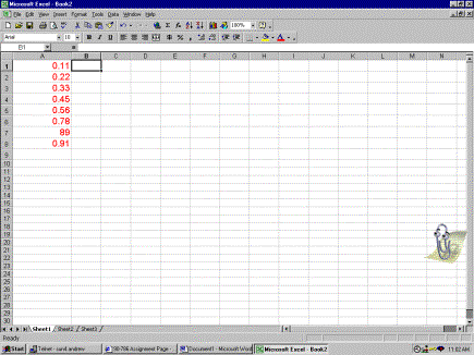
Let us choose a sequence of p2 value and input them column A
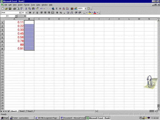
Step 2: Select column B1:B8 as the output cells.
Step 3: Input array formula in cell B1
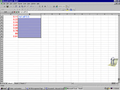
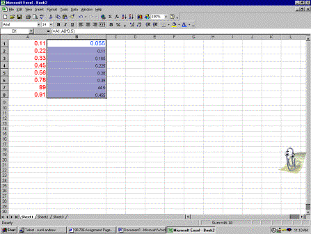
Step 4: Use the composite keys: CTRL+SHIFT+ENTER to start computing. You will see the results like this:
Step 5: Select the two columns just like Step2;
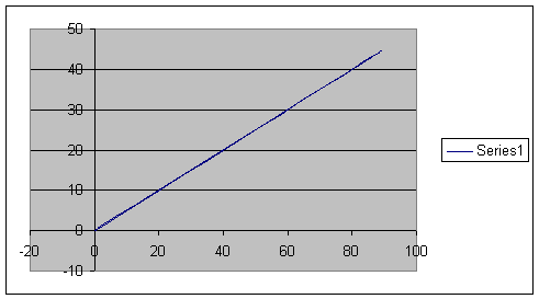
Step 6: Let us plot the function now. Click INSERT(from Menu Bar)>Chart>Select XY Scatter (from Chart Type Options)>Select your favorite Chart Sub-type>Click Next …>Click Finish. A chart will show up
Step 7: We can make some modifications to this graph: Change the labels of the
axis, change the scales or put a title for the graph.