|
DESIGNING LAYOUTS How should the content be presented? |
|||||||||||||
|
THE GENERAL GOAL Layout is about the presentation of content, both the arrangement (proximity) and order (sequence) of material. With a good layout you can provide your users with general information that will allow them to effectively use your site and find specific information (e.g., where to find navigation devices, text and other media content). |
|||||||||||||
|
GENERAL CONSIDERATIONS In designing an appropriate layout you should attempt to answer the follow questions: |
|||||||||||||
| + | What type of media will be presented? | ||||||||||||
| + | In what sequence will the media be presented (are they all on the screen at once or is there some sequence)? | ||||||||||||
| + | What is the target display size and proportion (especially the area the user will see at any given time)? | ||||||||||||
| + | Do not forget to include the default tool-bar in figuring the available display space -- for example, a 640 X 480 pixel screen resolution setting, the display space is only approximately 600 X 330 pixels. | ||||||||||||
| + | Unlike the printed page, the proportions of screen display areas are almost universally wider than they are high. | ||||||||||||
| + | Be aware of larger screen areas when designing smaller layout designs (is there too much white space at the bottom or the sides?). | ||||||||||||
| + | Must the content be easily printed? If so, the layout must be no wider than 7.5 inches. Also, the printed page should be identifiable independent of the rest of the site (e.g. frames problem). | ||||||||||||
|
GENERAL RULES OF THUMB The following guidelines are general principles, which should be applied intelligently and not mechanically. An individual design context may call for solutions contrary to these principles. In such a case it is absolutely acceptable to break a rule of thumb. You should, however, be able to articulate solid concrete reasons for doing so. NOTE: Naturally, a layout should be designed in tandem with the design of a navigation system. Ultimately, it is your goal to create a layout scheme that appropriately presents the designed navigation system. Although the design of layout schemes and the design of navigation systems are concurrent activities that influence and shape each other, the specific considerations and suggestions for designing navigation systems are addressed in Designing Navigation Systems. |
|||||||||||||
| + | Create a basic template or templates. Look at the overall content and identify parallelisms: is the material roughly parallel or extremely varied? Do you have a need to show the same kinds of media on each page? The same amount of text? | ||||||||||||
| + | Create a general grid system and let its proportions guide the placement of objects. This is particularly useful if you can isolate common areas for common types of elements (e.g. menu bars, headers, video clips, images, text). If necessary, "flex" the grid, but refrain from blatant violations, which may destroy the clarity of the layout scheme. | ||||||||||||
| + | Be sure your spatial relationships represent, as closely as possible, the actual relationships between objects. | ||||||||||||
| + | Restrict the width of lines of text. On-screen text is difficult to read, especially when the text lines are wide (e.g. spanning from the left to the right margin. | ||||||||||||
| + | Give elements ample breathing room. When you design a layout think consciously about the white space (the negative space) you are creating. Is the white space orderly, clean and clear? Is it balanced and proportioned throughout the page? What is the proportion of negative space to positive space? | ||||||||||||
| + | Do not try to put too much on one page (crowding) and do not make pages that are too long (too "scrolly"). | ||||||||||||
| + | Simplify what is on the screen and how it is presented (clarity). Find the "natural" order of what you are presenting (based on your categorized brainstorm lists). | ||||||||||||
| + | Aim for consistency of layout (balance the needs of the content and the scheme of order -- identity is not necessary). Allow for the needed flexibility of showing different things on different pages. | ||||||||||||
|
PROTOTYPING TECHNIQUES The following techniques are suggestions of possible ideation methods. Choose a method that best suits your needs and abilities. It is most important that you work in a manner that is comfortable and efficient. |
|||||||||||||
| + | For preliminary or rough concepts quickly sketch on paper or in Quark/Pagemaker/Illustrator. Use rectangles to represent images of varying dimensions, and use nonsense-text or horizontal lines to represent paragraphs of text. Try to generate as many concepts and iterations of concepts as possible. At this stage, do not invest a lot of time or effort in any one concept. Concept refinement will take place in subsequent steps of the design process. Treat this activity as a brainstorm session and suspend your critical judgment. | ||||||||||||
 |
|||||||||||||
| NOTE: For preliminary ideations do not design in HTML (it takes too long--you need the ease and freedom to rearrange and tweak quickly). Only when you are convinced of a concept's worth (after reflection and critical feedback) and have begun the process of iterative refinement, should you build it in HTML (to attempt to construct its layout or test it's navigation). | |||||||||||||
| + | If your defined goals and/or constraints require it, sketch layout schemes in an appropriately proportioned rectangle. Here are images of 640 X 480 and 800 X 600 browser windows. Print these out and photocopy them for sketching layouts. | ||||||||||||
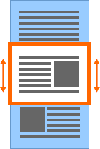
| + | Use a frame (cut out of another piece of paper or a rectangular shape in a page-layout program) to isolate the viewing area that the user will see at any given moment on the screen (e.g. the 3 X 4 proportions of a typical screen). | ||||||||||||
 |
|||||||||||||
| close | |||||||||||||
)
)